Mobile Optimization Initiative
UX, UI
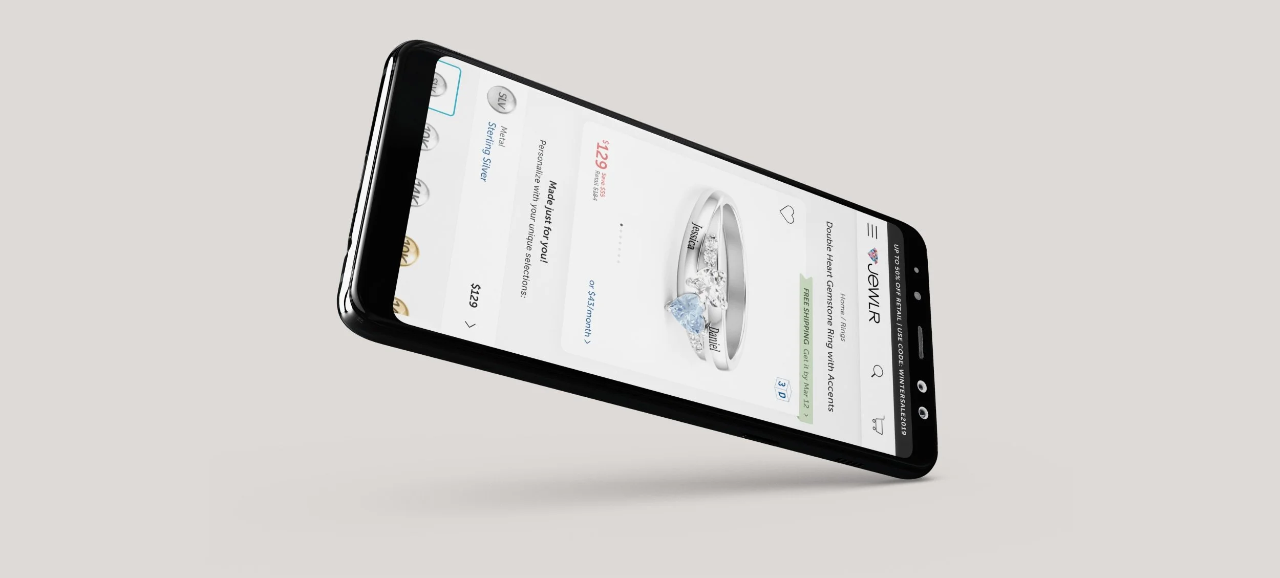
Prioritizing the mobile experience is essential for businesses to remain competitive in today's mobile-driven market. Facebook collaborated with Jewlr, an online jewellery retailer specializing in personalized pieces, to optimize the mobile experience through quantitative performance and UXUI design reviews. As the lead designer of the project at Jewlr, I synthesized research insights from this collaboration to establish a UXUI framework aligned with business needs, refining designs, and collaborating with the development team in implementing, testing and QA. The focus was on key purchase-driven pages like the product page, cart, and checkout.
PROBLEM
Despite 94.5% of Jewlr's content being viewed on mobile web, users were less likely to convert on mobile compared to desktop. Drop-offs occured at multiple touchpoints throughout the shopping journey, from personalizing on product pages to adding items to the cart and initiating checkout, resulting in lost conversions.
OBJECTIVE
To drive conversions and accelerate business growth by optimizing mobile experiences. This involved gaining deeper insights into how mobile users discover, shop, and make purchases, as well as understanding the ergonomics on smartphones and small touchscreen devices.
RESEARCH & FINDINGS
Facebook analyzed Jewlr's customer shopping behaviours, revealing that 69% of mobile users who added items to their cart did not initiate checkout, while 56% of those who did initiate checkout did not complete their purchase. It typically required 2.4 mobile visits for customers to convert, with converting visits lasting an average of 24.5 minutes, 12% longer than desktop visits. Previous case studies also showed increased conversions when accommodating the thumb's natural zone and ease of reach. For instance, auto-detected city and state in form entries led to a 7% increase in revenue per visit.
These insights guided the development of mobile optimization solutions, focusing on incentivizing checkout completion, enabling seamless shopping journey resumption, and minimizing friction throughout. Emphasis was placed on ensuring critical functions were easily accessible with one hand and thumb, aligning with users' ergonomic preferences.
SOLUTIONS
The product page, cart, and checkout flows underwent significant redesign. Page titles were relocated to the top for easy association with their content. Badges, colours, and varying text styles were strategically utilized to separate information and establish a clear hierarchy. Additionally, increased use of iconography and coloured outlines would help users digest information and denote highlighted selections effectively. Below are mockups that I created.
Before
After
Product page: Primary design changes were the introduction of breadcrumbs, separating the product image window from the personalization widget, and increasing the negative space around visual elements.
Before
After
Cart page: the same principles were applied to the cart flow. Since the previous design of the cart page shared remarkable similarities to the old product page, the new design was stylized more differently to clearly indicate to users that they have transitioned to the cart page.
Before
After
Checkout page: key departures from the previous design include prioritizing loyal customers by relocating the Sign In section to the top, indicating progress with numerical markers, providing clear instructions during input such as adding error messaging, allowing users to set Shipping as Billing address during the Shipping step, and ensuring the promo banner remains visible.


